Jennifer Caroline Campbell joins the humming mix of fatigue and hype that is the Frieze London crowd in Regents Park
The air is not as crisp as it could be and the leaves show just hint of red beginnings. A sign says ‘Only handbags and laptops past this point’ but my rucksack passes. I’m glad because I know I will need a tangerine break. It’s all about finding glimmers of orange —this is what a friend recently told me in an altered state, and she’s right. A glimmer of orange can be many things: a spark of curiosity, a coded cackle, a syrupy invitation, a snag, a fascination, a puncture, a quenching vision or a partially veiled secret, told under the breath. What kind of glimmers will surface for me at the annual art-cram today?
 |
Benedikte Bjerre, The Birds, 2017, foil, helium at Palace Enterprise Gallery |
My first find is a cluster of baby penguins swaying gently in the air-conditioned breeze. They take the opportunity to dance to the wafting currents made by the keen art seeking humans, who circulate all around them in an irregular stream. This bobbing flightless crew of helium chicks, The Birds by Benedikte Bjerre, feels like an apt start, playing effectively with both the local and wider context. A child runs through them and the whole group responds by leaning outwards and then right back in towards each other, briefly conspiring. I can sense their collective thirst for oceanic freedom, something that will never be fulfilled within this vacuumed carpet grid. As hypnotic as this installation is, I mustn’t linger here, I need to set an efficient pace. I am a worm with huge greedy eyes, and Frieze art fair is a rarely occurring apple. This is the unnatural mindset that takes hold when viewing art in this very particular way. I plan to navigate the space methodically, following the grid lines and leaving no stone unturned. But I soon get disoriented, and my path becomes the silken thread of a drunken spider surfing Brownian motion. Will the apple be juicy or full of brittle safe bets this year? Capital is leaking out, jeopardy is seeping in. And the bigger question looms over like a silent storm cloud, closer than ever, the question of who gets to see art, who gets to make art and who gets to be human. Art is never made or viewed in a vacuum, no matter how white the walls are. The world that surrounds the microcosm of Frieze this year feels particularly violent, cruel and divisive. I wonder what will retain meaning on the art platter in this kind of moment.
 |
| Kiki Furlan at Gianni Manhattan Gallery |
I stop in front of a peachy coloured fish, pictured in felt, part of Kiki Furlan’s solo presentation with Gianni Manhattan Gallery. The fish floats in fuzzy beige water, enveloped from its surroundings. Yet it also edges towards uncanny materiality, like a hidden memory surfacing from the shadows, inching slowly into graspable space. I wouldn’t want to grab this fish though, because the inviting softness of the felt is laced with a hint of something unnerving, like the rot on the underside of fruit when it takes you by surprise. This mix of seduction and repulsion is enriched by this work occupying a place between image and object, between illusion and body. Another of these felted pictures is more like a pretend drawing, black felted lines describe a straggly headless figure with clompy shoes, a soft grey backdrop feels close and a hand reaches towards a tiny tree.
 |
| Gal Schindler, Vagueness was the insides of nature, 2023, oil on wood at Galerie Sultana |
Nearby I find Gal Schindler’s quenching paintings in Galerie Sultana’s booth. In an instant Schindler’s paintings undo all the sly poison that I have contracted from looking at various female nudes in numerous old paintings. Suddenly its ok to have a human and feminine body, it’s a treat rather than a trap. I vow to moisturise every inch of myself more often. Slick but unruly, Schindler’s figures unashamedly and playfully take up space, licking across the pastel painted surface, while suggesting that they won’t stay put for long. Unfixed within their frames, they often spill over the edges of the canvas, like excessively applied eyeshadow wondering across a steady face. There is a feeling of chance embraced. Hurrying on, I’m caught by a large Florian Krewer painting (Michael Werner Gallery). Two figures in sporty winter clothes share an urban landscape with two dice, mid roll, perhaps just thrown. The ambiguous setting could be a flood lit carpark or empty motorway. Chance might be cruel or kind here, and all is fleeting, speeding uphill on tarmac. I check my watch; time is ticking too fast already.
 |
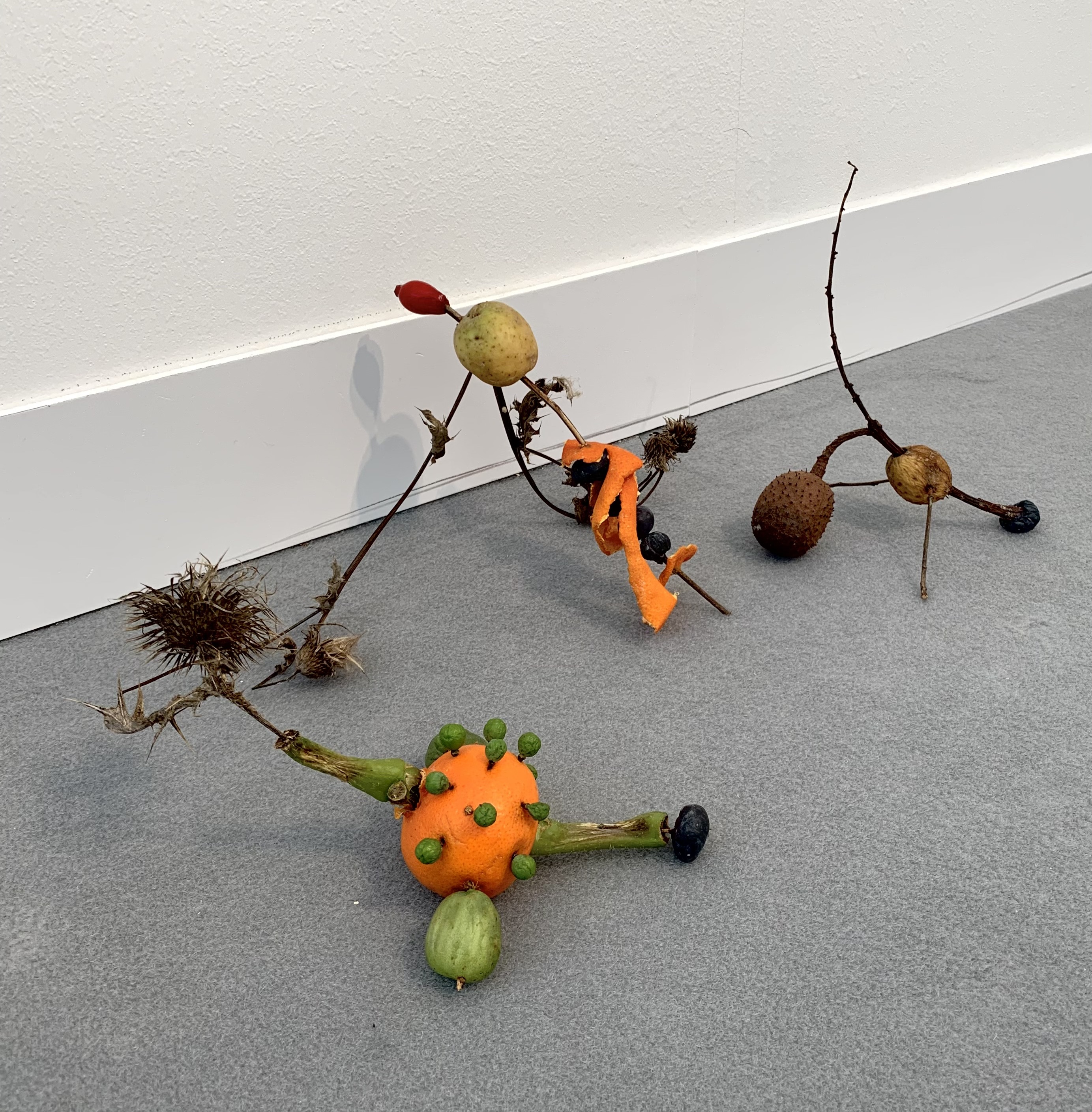
| Umico Niwa’s installation at Someday Gallery |
I rejoin the lazy river of movement, skipping past a few booths. My standards are higher now, having found some treasures already, and I’m quicker to dismiss certain artworks this year. No matter how much I agree (and I do agree) with statements like ‘refugees welcome’ or ‘my body my choice’, I have no interest in these words made in neon or stitch and stuck on a white wall. Maybe it’s the influence of the wider context: a destructive and divided world blinded by reductive slogans. Suddenly I’m drawn down close to the scratchy grey carpet by pieces of fruit, dried twigs and burnt leaves, parading and contorting there. This is Umico Niwa’s installation for Someday Gallery. Some of these fruity shrubby pieces cartwheel up metal ramps, arranging themselves in formation, some teeter on sharp edges, and some recline exhausted in corners. This work brings so many things to mind and twists them. I am reminded of making mazes for my pet gerbils when I was nine. At the same time, I think of futile moments spent trying to function in a world that often feels designed to trip me up. This installation also leads my thoughts to connect with things that I’ve read about microbial cooperation (via Melin Sheldrake) and the changeable behaviours of various genders of animal species (via Lucy Cooke). Niwa’s work snags me in just the right way, and I want to sit on the floor with it, to stretch and giggle. I must keep moving though, more orange slithers await my searching eyes.
 |
Rose Wylie, Ballet Backdrop, 2024, oil on canvas in four parts, 366 x 304 cm at David Zwirner |
A Tracy Emin monotype claws out at me unexpectedly, the one open eye of a scratched and scrunched figure holds my gaze. Only the top half of her is visible, held tightly by a black inky swamp. She is one of many, all versions of the same outsider, fiercely holding ground, every mark a corrosion. I hone in on some favourites — paintings by Lynette Yiadom Boakye and Ken Kiff that I was looking forward to seeing. But somehow these works seem disenchanted under the bright lights. Arts fairs can have a strange effect and not all art works thrive here. Swimming onwards I worry that the Rose Wylie paintings (David Zwirner gallery) will have lost their power too. But happily, I’m proved wrong. Wylie’s huge sludgy lines crawl across the canvas with their usual unbridled enthusiasm. Her giant painted girls wear triangular skirts, designer suits and nakedness. They are fragmented, repeated and send out an unapologetic chirping song. It’s like a dressing-up day at the best jumble sale, where everything has become zingy lumpy toothpaste and delicious lipstick is plastered onto parading mouths.
 |
| Georg Baselitz, Bob Flies up into the Sky, 2023, oil and plastic on canvas, 309 x 484 x 5 cm at White Cube |
Just when I thought my headache was going to ground me into pulp, a towering Georg Baselitz (White Cube Gallery) knocks me into a new weightlessness. I gape upwards at the exposed pink bellies of twin birds who glide confidently across a brisk ice sky. Skating swiftly on, I’m strangely welcomed in by a large painting of a quivering reddish tree with specks of mustard (Oliver Bak’s painting with Spruth Magers). Its shadow is like a speckling of cherry stains on dusky low-lying mist. Maybe I need to go outside and look at a squirrel? Maybe a I need to go outside and hold a squirrel? ‘Yes, you do' nods an allied fox, breaking from its usual stealth and making itself visible in a Bill Lynch painting (Approach Gallery). No time for a pinch of park life though, I’ve got to cram some more glimmers into my sagging eyes.
 |
| Rory Pilgram, Who do I Choose to Follow, 2023, oil, crayon, pencil & nail polish on paper, 70 x 100 cm at Maureen Paley |
I try a booth that attracts me from a distance, but on closer inspection is packed full of formulaic landscape paintings, like giant stagnant jigsaw puzzles. No time for this nothingness. Crawl onwards, I must. Some vibrant works on paper by Rory Pilgram (Maureen Paley Gallery) give me just the vitamin I need. Crayon, pencil and nail polish tell of adventures where horses and humans frequent glowing green and pink lakes under dancing skies, beside galloping fields and whistling sea. Drawings always have a particularly strong voice at Frieze. The architecture of the fair is repetitive, like airport queuing systems, and my already-keen thirst for imperfect human-made lines is ramped up, an antidote to my surroundings. I come across an elegantly splotchy painting of a princess-like lady leaning against an accommodating tree at Almine Rech’s Booth. She wears a powder-blue Miss-Muffet-style dress that is threatening to sail her right up into the fairytale sky above. In the background a pink castle with unblinking windows waits earnestly. This painting is by Genieve Figgis, who lives the Wicklow Mountains near Dublin, and makes fabulous absurd painted retellings of historical subjects, goulash and luscious in equal measure. This painting refuels me.
 |
| Naminapu Maymuru-White at Sullivan and Strumpf |
Pumped up on these multicoloured fantasies, I worry that a sugar crash is on the horizon. But Naminapu Maymuru-White’s paintings scoop me up just in time. Her works, on display at Sullivan and Strumpf, are all made with white earth pigment on bark and they invite me to dance with my headache instead of resisting it. The cold light of the art fair becomes a thriving shimmer when filtered through her effortless blend of figuration and abstraction. The works are intricate but not fussy, and they flow like a circular story weaving a time-bending rhythm. Maymuru-White lives and works in Yirrkala, Arnhem Land in the Northern Territory, Australia, and is one of the first Yolŋu women to be taught to paint miny’tji (sacred creation clan designs). I almost fall over looking at them, a bit like when standing in front of one of Bridget Riley’s monochrome op art paintings. Riley’s hard lines and aggressive illusionary effect often make me nauseous. In contrast, Maymuru-White’s paintings have a singing touch that both elevates and softens their optical effect. She uses repeat and pattern to transcend the surface of the gently warping bark. I want to spend time with these paintings is a very different setting from here.
 |
| Gabriella Boyd at Grimm Gallery |
With a taste for abstraction alight in my belly, I am excited to find two tall paintings by Gabriella Boyd. Previously I have enjoyed Boyd’s paintings for their ability to hover between internal and external, between recognisable and not. These two paintings (named Sun (i) and Sun (ii), part of Grimm Gallery’s display) seem to burst into a new zone, her usual textured and prancing brush marks move further towards an abstract space that could have been sculpted by sudden sunlight. I could step into these spaces, hold the twisted forms and untangle the darting spurts of line. But I would not want to because that would undo this concoction of touched energy.
 |
| Ali Eyal, Look what I Remember, 2024, oil on canvas, 83 x 101 cm at ChertLüdde |
Despite my now hastening gait, I look for a long while into a splintered goofy landscape populated with bodies that seem horribly soft, like jittery legs after a clanky rollercoaster. Ali Eyal’s painting, Look what I Remember at ChertLüdde, lets me know about both old and present disasters in a new way. Like a child’s memory pulling at an adult’s shirt sleeve, it is a necessary reminder of the brutal steamroller of destruction still rolling in the distance, and all the unimaginable crumbling crying worlds it leaves in its wake. It reminds me of Phillip Guston’s skill with fleshy cartoonised motifs, in the sense that a comic voice can be the jester in the room, speaking about the things that other voices cannot. But in contrast to Guston, this is a small and intricate painting, more wispy than slabby. It interjects an effective unease, while only speaking as loudly as a tea stain. Its sickened landscape, populated by lost shoes and subtly contorting men in beige uniforms, brings the looming question to the surface again, the question of who gets to be human. It is a truthfully distorting window through time and space and a necessary puncture in the art fair bubble. I flick back into the present, blinking. Time is running out.
An oversized, ruddied and bejewelled, extraterrestrial crustacean threatens to devour me. This is Nils Alix Tabeling’s sculpture, and it might jump out of Public gallery’s booth, as fast as a mother tarantula in bristling stilettos. In the centre of her body hangs an intricate gathering of sacred charms that might bewitch me if she desires. She is spiky and influential, like the glamorous but hardy person at the party who can throw shade as casually as a blow dart. Ellen Berkenblit’s painting (at Contemporary Fine Art) gives me a similar feeling of a sharp yet muted aggression. A claustrophobically cropped figure looks towards something outside of the frame, with a seething glare, while a gramophone horn shouts at the back of her head, where her hair is ironed perfectly straight. An untethered light bulb is beginning to flash a red warning while threatening to plug into her collar bone. It’s a freeze-frame of a nightmare and the protagonist is reassuringly tough, her eyes hardened over like a digital insect. My eyes, in contrast, are becoming mushy with overload, unscreened they have let everything in.
 |
| Eva Gold at Rose Easton |
Just as I’m about to escape into the park with my uneaten tangerine and dry mouth, I spot Eva Gold’s installation in Rose Easton’s booth, where an off-white leather sofa faces a mute charcoal drawing of a burning shed. It is as if the drawing itself is waiting to combust. A pile of printouts where a coffee table should be offer confessional notes that feel close to the bone. This curbed outpouring, fictitious or not (or both), clings to my exhausted thoughts like a sour flavour. James Baldwin once said, ‘art has to be a kind of confession’ and he is right. He also said, ‘Artists are here to disturb the peace’. True enough, but this is so often taken the wrong way. Try too hard to be loud and you become invisible, blending into the racket that is the backdrop to current living. Gold gets it just right with this icy twin of a living room, slotted in amongst the art hustle. It is a quiet disrupter and its staged atmosphere of control is a glint of realness, pinning down the entire art fair like a carefully flung shard of plastic.
 |
| Eva Gold, Acts of Violence (after Haneke), 2024, at Rose Easton |
I stumble out into the dimming park, where small dogs in fashionable jackets yap into the coming night. I witness a crow drinking coffee from a discarded takeaway cup. Flooded with the afterimages of all that I have seen, and the connected tangle of thoughts, I pop a paracetamol and gratefully head home for a jacket potato.
Jennifer Caroline Campbell
Frieze London
Regents Park, London NW1
9-13 October 2024